

为了降低属性输入组件的实现难度,使用混入类对组件中通用的属性,事件等进行了统一封装。
在实现一个新的值类型输入组件时,需要引入混入类,混入类中定义过的属性事件不需要重新定义,可直接使用。
混入类中明确定义了值输入组件与外部框架进行值传递的规范,实现时请严格按照规范执行,不按规范进行值传递可能造成不可预知缺陷。
属性值输入组件大致可以分为两类,一类是平铺型组件,一类为弹窗组件(modal, drawer)。相应的,混入也分为两类,需要引入对应的混入才能有相应的效果。
何时使用
弹窗型组件指的是有容器(如modal,drawer)包裹的,由属性栏上渲染的弹窗触发器触发的组件。
弹窗触发器为平铺组件,框架内置了默认的弹窗触发器,用户可参考默认触发器开发新的弹窗触发器
弹窗组件示例


源码展示
import { Component, Vue, Prop } from 'vue-property-decorator';
import { cloneDeep } from 'lodash';
import { ComponentNeedShow } from 'cloudpivot/common';
import { mixins } from 'vue-class-component';
@Component
export class PropertyModalBase extends mixins(ComponentNeedShow) {
  modalData: any = null;

  afterSHow(initData) {
    this.modalData = cloneDeep(initData);
  }

  backData(value: any) {
    this.$emit('backData', value);
  }

  otherValueChange(key, value) {
    this.$emit('otherValueChange', key, value);
  }
}
// 需要外部组件通过ref调用show方法才能显示的组件,需要混入此mixin
import { Component, Vue, Prop } from 'vue-property-decorator';
import { observeModal } from 'cloudpivot/common/src/utils/dom';
@Component
export class ComponentNeedShow extends Vue {
//核心组件类型
componentType: 'modal' | 'drawer' | 'popover' | 'big-dialog' = 'modal';
componentVisible = false;
//核心组件的包装class
wrapClassName = '';
noFooter = false;
/**
* 组件的显示只有一个入口,就是本方法
* @param initData 初始化数据,某些数据需要在显示时传入
*/
show(initData?: any) {
let modalWrapClass = this.wrapClassName;
if (this.wrapClassName.includes(' ')) {
modalWrapClass = this.wrapClassName.split(' ')[0];
}
this.beforeShow(initData);
this.componentVisible = true;
this.afterShow(initData);
if (this.componentType === 'modal' && modalWrapClass) {
this.$nextTick(() => {
observeModal(modalWrapClass, {
noFooter: this.noFooter,
});
});
}
}
/**
* 组件的隐藏应该只有一个入口,就是本方法
*/
hidden() {
this.componentVisible = false;
this.afterHidden();
}
beforeShow(initData?: any) {}
afterShow(initData?: any) {}
afterHidden() {}
}属性说明
何时使用
平铺型输入组件指的是组件直接渲染在属性名周围,不会有容器包裹。
源码展示
import { Component, Vue, Prop } from 'vue-property-decorator';
import { defaultNotEmpty } from '.';
import { isEqual } from 'lodash';
@Component
export class PropertyComponentBase extends Vue {
  @Prop({ default: false })
  disabled!: boolean;

  @Prop()
  defaultValue!: any;

  @Prop()
  value!: any;

  @Prop()
  maxLength!: number;

  @Prop()
  validError!: boolean;

  @Prop()
  title!: boolean;

  @Prop()
  getValueValidateErrorMessage!: Function;

  @Prop()
  isNotEmpty!: any;

  //是否展示错误文案
  @Prop()
  showErrorText!: boolean;

  @Prop()
  emptyErrorText!: string;

  //当前处于批量设计模式,批量设计下某些组件要更换渲染逻辑
  @Prop()
  batchMode!: boolean;

  get errorText() {
    if (!this.showErrorText) {
      return '';
    }

    if (this.validError) {
      return this.requiredErrorText || this.valuePatternErrorText;
    } else {
      return this.valuePatternErrorText;
    }
  }

  get requiredErrorText() {
    const emptyErrorText = this.emptyErrorText || `${this.title}不能为空`;
    if (typeof this.isNotEmpty === 'function' && !this.isNotEmpty(this.value)) {
      return emptyErrorText;
    } else if (!this.isNotEmpty && !defaultNotEmpty(this.value)) {
      return emptyErrorText;
    }
    return '';
  }

  get valuePatternErrorText() {
    if (
      typeof this.getValueValidateErrorMessage === 'function' &&
      this.getValueValidateErrorMessage({ value: this.value })
    ) {
      return this.getValueValidateErrorMessage({ value: this.value });
    } else {
      return '';
    }
  }

  mounted() {
    if (
      this.defaultValue !== undefined &&
      !isEqual(this.value, this.defaultValue)
    ) {
      //初始值的赋值只有在默认值与当前值不相等时才能进行,不然可能引发一些无用的监听逻辑
      if (this.isNotEmpty && typeof this.isNotEmpty === 'function') {
        if (!this.isNotEmpty(this.value)) {
          this.onValueChange(this.defaultValue);
        }
      } else if (!defaultNotEmpty(this.value)) {
        this.onValueChange(this.defaultValue);
      }
    }
  }

  onValueChange(newVal) {
    this.$emit('change', newVal);
  }

  //将数据保存在controller上,做缓存
  saveCacheData(key, value) {
    this.$emit('save', key, value);
  }

  otherValueChange(key, value) {
    this.$emit('otherValueChange', key, value);
  }

  //触发一次初始化的propertyChange事件
  initPropertyChange() {
    this.$emit('initPropertyChange');
  }
}
属性说明
属性名 | 说明 | 属性值类型 |
disabled | 是否禁用,某些组件禁用态有不同的展示形式 | boolean |
defaultValue | 值为空时使用到的默认值 | any |
value | 值 | any |
maxLength | 最大长度 | number |
validError | 属性值校验状态 | boolean |
title | 属性标题 | string |
getValueValidateErrorMessage | 获取校验失败状态下的失败文案的函数 | function |
isNotEmpty | 判断值不为空的函数 | function |
showErrorText | 是否显示错误文案 | boolean |
emptyErrorText | 错误显示文案 | string |
batchMode | 是否开启批量模式,批量模式下组件展示可能发生变化 | boolean |
errorText | 属性校验错误文案 | string |
函数说明
函数名 | 说明 | 参数 |
onValueChange | 属性值改变,向外界传值函数 | 新的属性值 |
saveCacheValue | 将中间值保留在controller上,刷新会被清空 | 保存的key,保存的value |
otherValueChange | 非controller直接绑定的属性值改变,不会触发subscribtion | 目标属性key,新的目标属性值 |
initPropertyChange | 触发一次初始化的propertyChange事件 | 无 |
河图属性设计器中内置了常用的属性输入组件
import { propertyRegister } from '../scripts';
import PropertyTextInput from './property-text-input.vue';
import PropertyTextArea from './property-text-area.vue';
import PropertyCheckbox from './property-checkbox.vue';
import PropertyDateSelect from './property-date-select.vue';
import PropertyModal from './property-modal.vue';
import PropertyRadio from './property-radio.vue';
import PropertySelect from './property-select.vue';
import PropertyStaffSelector from './property-staff-selector.vue';
import PropertySelectDataitem from './property-select-dataitem.vue';
import PropertySwitch from './proprety-switch.vue';
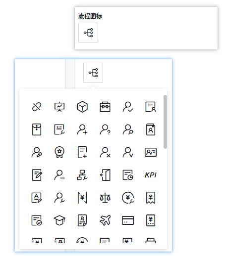
import PropertyIconSelect from './property-icon-select.vue';
propertyRegister
.append('property-text-input', PropertyTextInput)
.append('property-text-area', PropertyTextArea)
.append('property-checkbox', PropertyCheckbox)
.append('property-date-select', PropertyDateSelect)
.append('property-modal', PropertyModal)
.append('property-radio', PropertyRadio)
.append('property-select', PropertySelect)
.append('property-staff-selector', PropertyStaffSelector)
.append('property-select-dataitem', PropertySelectDataitem)
.append('property-switch', PropertySwitch)
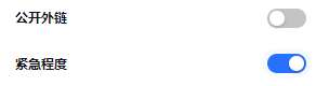
.append('property-icon-select', PropertyIconSelect);开关选择器
何时使用
需要表示开关状态/两种状态之间的切换时;
和
checkbox的区别是,切换switch会直接触发状态改变,而checkbox一般用于状态标记,需要和提交操作配合。
代码演示
API
属性如下
属性 | 说明 | 类型 | 默认值 |
trueValue | 自定义true值 | PanelConfig | - |
falseValue | 自定义false值 | number | - |
FAQ
下拉选择器。
何时使用
弹出一个下拉菜单给用户选择操作,用于代替原生的选择器,或者需要一个更优雅的多选器时。
当选项少时(少于 5 项),建议直接将选项平铺,使用 Radio 是更好的选择。
代码演示
API
属性如下
属性 | 说明 | 类型 | 默认值 |
placeholder | 缺省显示文案 | string | - |
selectOptions | 选项数据 | OptionData[] | - |
menuNoScroll | 下拉菜单不支持滚动 | boolean | false |
multiple | 支持多选 | boolean | false |
disabled | 禁用 | boolean | false |
FAQ
选择数据项
何时使用
需要选中一个数据项时
代码演示
API
属性如下
属性 | 说明 | 类型 | 默认值 |
placeholder | 缺省显示文案 | string | 请输入 |
dropdownPlaceRight | 悬浮框显示在右侧 | boolean | false |
dataItems | 数据项列表 | DataItem[] | [] |
filterFunc | 数据项列表的筛选函数 | function | - |
modelName | 数据项来源模型名称 | string | - |
menuNoScroll | 下拉菜单不支持滚动 | boolean | false |
FAQ
单选框。
何时使用
用于在多个备选项中选中单个状态。
和 Select 的区别是,Radio 所有选项默认可见,方便用户在比较中选择,因此选项不宜过多。
代码演示
API
属性如下
属性 | 说明 | 类型 | 默认值 |
selectOptions | 选项数据 | OptionData | - |
batchMode | 批量模式 | boolean | - |
FAQ
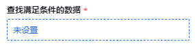
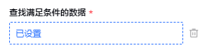
弹窗组件触发器,是弹窗组件的外层包裹组件,负责显示弹窗已经清空数据相关逻辑
何时使用
属性输入需要使用到弹窗,并且弹窗外部触发组件符合一定规范
本组件只负责调用弹窗组件的show方法,请确保弹窗组件内拥有show方法
参数中的modalName是后续寻找关联弹窗组件的标识,查找范围还是在注册器注册的组件内
代码演示
API
属性如下
属性 | 说明 | 类型 | 默认值 |
modalName | 弹窗组件定位名称 | string | - |
showSwitch | 是否展示开关 | boolean | false |
disabled | 是否禁用 | boolean | false |
showDeleteConfirm | 删除数据时,是否显示确认弹窗 | boolean | Function | false |
confirmText | 确认弹窗的文案 | string | - |
FAQ
日期选择
代码演示
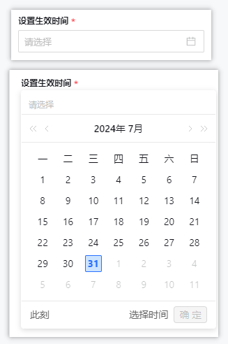
API
属性如下
属性 | 说明 | 类型 | 默认值 |
placeholder | 属性栏配置对象 | PanelConfig | - |
disabled | 是否禁用 | boolean | false |
FAQ
单行文本输入组件
何时使用
常规的文本输入
代码演示
API
属性如下
属性 | 说明 | 类型 | 默认值 |
placeholder | 属性栏配置对象 | PanelConfig | - |
maxLength | 最大长度 | number | - |
disabled | 是否禁用 | boolean | false |
FAQ
多行文本输入组件
何时使用
多行文本输入
组件演示
API
属性如下
属性 | 说明 | 类型 | 默认值 |
placeholder | 属性栏配置对象 | PanelConfig | - |
maxLength | 最大长度 | number | - |
disabled | 是否禁用 | boolean | false |
autoSize | 行数限制 | {minRows: number, maxRows: number} | {minRows: 6, maxRows: 6} |
divideByTwo | 计算长度时,中文算两个,英文算一个 | boolean | false |
showCount | 在末尾处展示长度信息 | boolean | false |
FAQ
多选框组件
何时使用
在一组可选项中进行多项选择时;
单独使用可以表示两种状态之间的切换,和
switch类似。区别在于切换switch会直接触发状态改变,而checkbox一般用于状态标记,需要和提交操作配合。
代码演示
API
属性如下
属性 | 说明 | 类型 | 默认值 |
selectOptions | 选项数据 | OptionData | - |
disabled | 是否禁用 | boolean | false |
FAQ
为了快速地添加输入组件以及使用已存在的组件,引入属性输入组件注册器
何时使用
需要使用河图属性设计器,并且仅靠内置的属性输入组件无法实现具体的值输入场景,需要引入新的值输入组件。
class PropertyRegister {
  assets: any = {};

  /**
   * 组件注册
   * @param viewType
   * @returns
   */
  append(componentName, componentAsset) {
    if (this.assets[componentName]) {
      //重复注册提示
      console.error(`The component ${componentName} has been registered!`);
      return;
    }
    this.assets[componentName] = componentAsset;
    return this;
  }

  //获取所有注册的组件
  getAssets(componentName?: string) {
    return componentName ? this.assets[componentName] : this.assets;
  }
}
export const propertyRegister = new PropertyRegister();
import { propertyRegister } from 'cloudpivot-designer/designer-core/property-panel';
import ReceiverSelectModal from './receiver-select-modal.vue';
import BindBizMethodModal from './bind-biz-method-modal.vue';
import SingleConditionGroup from './single-condition-group.vue';
import TwoConditionGroup from './two-condition-group.vue';
import RuleVariableModal from './rule-variable-modal.vue';
propertyRegister
.append('receiver-select-modal', ReceiverSelectModal)
.append('bind-biz-method-modal', BindBizMethodModal)
.append('single-condition-group', SingleConditionGroup)
.append('two-condition-group', TwoConditionGroup)
.append('rule-variable-modal', RuleVariableModal);注意事项
属性注册器添加组件,为了避免影响其他模块的正常使用,只允许添加组件,不允许覆盖组件
属性栏配置的价值在于简化属性的外在表现,隐藏输入组件的实现逻辑。
类型定义
/**
 * 属性面板的配置,包含多个属性的配置以及
 * 一些整体的配置
 */
export interface PanelConfig {
  //分组信息
  groups?: GroupInfo[];

  //必填属性code列表
  required: string[];

  //隐藏标题的属性code列表。注意:不设置属性title也可以达到此效果
  hiddenTitle?: string[];

  //属性信息
  properties: PropertySchema[];

  //事件订阅,各种回调函数
  subscriptions: PropertySubscription;
}
代码演示
import { PanelConfig } from 'cloudpivot-designer/property-panel';
import { DataItemType } from 'cloudpivot-form/form/schema';
import { verifyVariableInRule } from '../property-component-modal/scripts/verify-variable-in-rule';
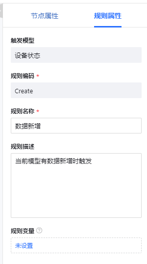
const panelRuleProperty: PanelConfig = {
groups: [
{
value: 'base',
label: '基础属性',
keys: ['modelName', 'code', 'name', 'remarks', 'ruleVariable'],
},
],
required: ['code', 'name'],
properties: [
{
title: '触发模型',
code: 'modelName',
inputComponentName: 'property-text-input',
options: {
disabled: true,
},
},
{
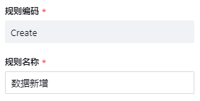
title: '规则编码',
code: 'code',
inputComponentName: 'property-text-input',
getRequiredErrorMessage: () => {
return '业务规则编码不能为空!';
},
options: {
disabled: (businessContext: any, propertiesData: any) => {
//节点使用edit辨别是否保存过,规则使用id
return !!propertiesData.id;
},
},
},
{
title: '规则名称',
code: 'name',
inputComponentName: 'property-text-input',
getRequiredErrorMessage: () => {
return '业务规则名称不能为空!';
},
options: {
maxLength: 50,
},
},
{
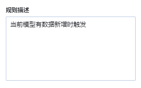
title: '规则描述',
code: 'remarks',
inputComponentName: 'property-text-area',
options: {
maxLength: 100,
},
},
{
title: '规则变量',
code: 'ruleVariable',
inputComponentName: 'property-modal',
showDeleteConfirm: (variableList) => {
return verifyVariableInRule([], false).then((verifyResult) => {
return !verifyResult;
});
},
confirmText: '规则变量已在规则中使用,请谨慎删除',
options: {
modalName: 'rule-variable-modal',
tips: '如同表单字段,可以存放某个动作节点运行结果,可用于后续的判断、赋值。业务规则运行结束后,变量值会被清空重置',
defaultValue: [],
},
},
],
subscriptions: {
onPropertyChange(
code,
value,
oldValue,
propertiesData,
propertyControllerMap,
businessContext,
) {
if (code === 'ruleVariable') {
verifyVariableInRule(value);
}
},
},
};
export default panelRuleProperty;属性的自定义渲染依赖于属性的自定义配置。属性的配置中需要指定属性的编码,标题,输入组件参数等重要信息。
类型定义
interface PropertySchema {
  //属性标题,如果不设置则表示不需要显示标题
  title?: string;
  //属性编码
  code: string;
  /**
   * 输入组件值的映射,如果只是简单通过code取可以不设置,如果是多个属性合并的场景,需要配置
   * 例如:code为a,b,c,valueMap为['a','b','c'],则输入组件的值为{a:1,b:2,c:3}
   **/
  valueMap?: string[] | any;
  //属性提示
  tips?: string;
  //输入组件名称
  inputComponentName: string;
  // 自定义的判空逻辑,如果不设置则默认为!!value
  isNotEmpty?: (value: any) => boolean;
  // 自定义的必填提示文案,如果不设置走默认文案逻辑
  getRequiredErrorMessage?: (controller, propertiesData) => string;
  // 必填以外的校验逻辑,校验后的提示文案
  getValueValidateErrorMessage?: (controller, propertiesData) => string;
  //默认值函数
  defaultValue?: (businessContext, propertiesData: any) => any;
  //弹窗组件是否需要显示删除确认弹窗
  showDeleteConfirm?: boolean | ((value: any) => boolean | Promise<boolean>);
  //弹窗组件删除确认弹窗文案
  confirmText?: string;
  //隐藏整个组件的判断函数,只支持简单场景,如果需要用到的数据在controller中,需要在subscription中处理
  hiddenFunc?: (propertiesData: any) => boolean;
  //属性值传递给组件时进行的映射
  inputValueTransform?: (value: any) => any;
  //组件值传递给属性时进行的映射
  outputValueTransform?: (value: any) => any;
  //组件的参数props
  options?: any;
}对各个属性进行分组的分组信息,可设置分组的标题、问号提示、展示收起效果等
何时使用
需要对所有属性进行分组展示时,如果不需要分组展示,可不设置本属性。
类型定义
interface GroupInfo {
  label?: string;
  value: string;
  keys: string[];
  expend?: boolean;
  // 分组提示
  groupTips?: string;
  canExpand?: boolean;
  defaultExpand?: boolean;
}
代码示例
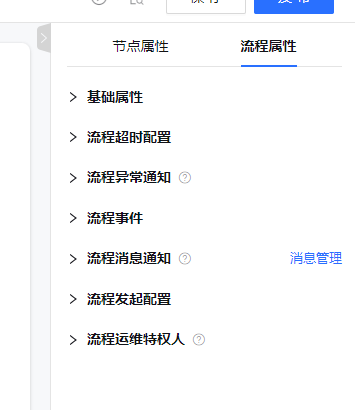
const panelWorkflowProperty: PanelConfig = {
  groups: [
    {
      value: 'baseConfig',
      label: '基础属性',
      keys: [
        'workflowCode',
        'workflowName',
        'icon',
        'document',
        'externalLinkEnable',
        'shortCode',
        'urgencyConfig',
      ],
      canExpand: true,
    },
    {
      value: 'workflowTimeoutConfig',
      label: '流程超时配置',
      keys: ['timeoutConfig'],
    },
    {
      value: 'workflowExceptionNotice',
      label: '流程异常通知',
      keys: ['exceptionNotifyConfig'],
      groupTips: '当流程发生异常时,通知配置好的人员',
      canExpand: true,
    },
    {
      value: 'workflowEvent',
      label: '流程事件',
      keys: [
        'startEventHandler',
        'endEventHandler',
        'cancelEventHandler',
        'activateEventHandler',
      ],
      canExpand: true,
    },
    {
      value: 'workflowMessage',
      label: '流程消息通知',
      keys: ['messageManage', 'todoDataItems'],
      groupTips: '可定义流程流转到各节点时,审批人接收到的信息',
      canExpand: true,
    },
    {
      value: 'workflowStartConfig',
      label: '流程发起配置',
      keys: ['workflowStartConfig'],
      canExpand: true,
    },
    {
      value: 'workflowPrivilege',
      label: '流程运维特权人',
      keys: ['workflowPrivilegeSetting'],
      groupTips: '配置对该流程拥有运维操作权限的人',
      canExpand: true,
    },
  ],
};