

列表设计元数据结构
字段名 | 类型 | 说明 |
code | string | 视图编码 |
name | string | 视图显示名称 |
name_i18n | string | 视图显示名称多语言 |
queryActions | Array | 视图列表按钮 |
queryColumns | Array | 视图列表展示字段 |
queryConditions | Array | 视图列表查询字段 |
querySorts | Array | 视图列表排序字段 |
schemaCode | string | 模型编码 |
clientType | number | PC视图/移动端视图 |
queryPresentationType | number | 视图类型 |
showOnPC | boolean | 是否在PC端启用 |
showOnMobile | boolean | 是否在移动端启用 |
publish | boolean | 发布状态: 未发布0 已发布1 |
queryPresentation | string | HTML编辑配置信息Json |
一、视图列表按钮queryAction数据结构
字段名 | 类型 | 说明 |
actionCode | string | 操作按钮编码 |
name | string | 操作按钮名称 |
name_i18n | string | 操作按钮名称多语言 |
queryId | string | 列表Id |
schemaCode | string | 模型编码 |
systemAction | boolean | 是否是系统自带的按钮 |
associationType | number | 关联方式: 1关联流程 0关联表单 |
associationCode | string | 关联流程或表单的编码 |
serviceCode | string | 业务方法编码 |
customService | boolean | 是否自定义业务方法 |
serviceMethod | boolean | 自定义业务方法 |
queryActionType | number | 按钮类型 |
sortKey | number | 排序号 |
二、视图列表展示字段queryColumn数据结构
字段名 | 类型 | 说明 |
name | string | 字段名称 |
name_i18n | string | 字段名称多语言 |
propertyCode | string | 字段编码 |
propertyType | number | 数据项类型 |
isDefaultProperty | boolean | 是否系统数据项 |
queryId | string | 列表ID |
schemaCode | string | 模型编码 |
displayFormat | number | 显示格式 |
width | string | 宽度px,% |
unit | number | 单位 0:px,1:% |
sortKey | number | 排序号 |
sumType | number | 数值类型有效 求和 平均值 最大值 计数 |
relativeSchemaCode | string | 关联的模型编码 |
childColumns | Array | 选择导出子表展示数据项, 同外层 |
三、视图列表查询字段queryCondition数据结构
字段名 | 类型 | 说明 |
name | string | 查询字段名称 |
name_i18n | string | 查询字段名称多语言 |
queryId | string | 列表ID |
schemaCode | string | 模型编码 |
propertyCode | string | 查询字段编码 |
propertyType | number | 数据项类型 |
dataStatus | string | 单据状态 |
sortKey | number | 排序码 |
displayType | number | 显示类型 |
defaultValue | string | 默认值 |
relativeQueryCode | string | 关联的列表编码 |
relativeSchemaCode | string | 关联的模型编码 |
startValue | string | 查找范围起始值 |
endValue | string | 查找范围结束值 |
options | string | 选项 |
userOptionType | number | 人员配置条件类型 |
choiceType | number | 选择类型 |
visible | boolean | 是否可见 |
defaultState | number | 默认状态 |
accurateSearch | boolean | 是否精确查找 |
displayFormat | string | 显示格式 |
四、视图列表排序字段querySort数据结构
字段名 | 类型 | 说明 |
name | string | 排序字段名称 |
name_i18n | string | 排序字段名称多语言 |
propertyCode | string | 排序字段编码 |
propertyType | number | 数据项类型 |
queryId | string | 列表ID |
schemaCode | string | 模型编码 |
direction | number | 排序方式 |
sortKey | number | 排序号 |
五、HTML编辑配置信息queryPresentation数据结构
字段名 | 类型 | 说明 |
htmlJson | string | 列表html配置 |
actionsJson | string | 列表按钮配置 |
columnsJson | string | 列表单元格配置 |
1. htmlJson元数据结构
字段名 | 类型 | 说明 |
styleJson | string | 自定义样式 |
scriptJson | string | 自定义脚本 |
templateJson | string | 如果此字段有值,则不解析预设的模板布局(预留) |
2. actionsJson元数据结构
字段名 | 类型 | 说明 |
actionCode | string | 按钮编码 |
attributes | Objact | 自定义属性 |
3. columnsJson元数据结构
字段名 | 类型 | 说明 |
propertyCode | string | 数据项编码 |
custom | Object | 自定义Html内容 |
a. custom元数据结构
字段名 | 类型 | 说明 |
list | string | 列表视图下单元格的自定义 |
board | string | 看板视图下单元格的自定义 |
calendar | string | 日历视图下单元格的自定义 |
自定义视图设计
!注:实现自定义功能需要具备一定的编码知识和能力
相关文档:
前端基础: HTML / CSS / Javascript
框架知识: Vuejs
数据结构: 视图设计元数据
相关说明:
PC 端和 Mobile 端皆支持视图自定义功能, 功能点包括:
自定义样式
自定义按钮
自定义模板
自定义脚本
双端的特性和侧重点不同, 对自定义的支持也不同, 其中:
自定义样式都支持
自定义按钮不支持 Mobile 端
自定义模板在 PC 端当前版本固定为 table, 仅支持少量自定义; Mobile 支持完全自定义;
自定义脚本在 Mobile 端不支持自定义按钮功能, 其他方面与 PC 端无异
每个视图都有各自独立的配置
每个视图下的双端的配置也各自独立,互不干扰
自定义入口:
PC 端自定义
样式模块
功能:
样式控制不限于视图, 可作用于整个页面
但所设样式仅对当前视图页有效, 会随着页面加载卸载
示例:
<style id="customStyle">
    /* 样式可对当前页面所有元素生效 */

    /* 设置顶栏背景颜色 */
    .header { background-color:#ECECEC; }
    /* 设置“新增”按钮边框颜色和背景颜色 */
    .list-action-add {
        border-color:#67C23A;
        background-color:#67C23A;
    }
</style>
得到:
按钮模块
功能:
PC 端有五个预设按钮: 新增、删除、导入、导出、打印二维码
按钮有 code、text、id、class 属性, 其中:
code 作为唯一逻辑标识, 必填且必须在视图内唯一
text 作为按钮名称
id 按钮标签id, 非必填
class 按钮标签类名, 非必填;如不定义,会默认使用 `list-action-${actionCode}`;
其中, 自定义按钮可修改全部属性,预设按钮不能删除,也不支持修改 code 属性
示例:
<section id="list-actions">
  <action code="add" text="新增" class="list-action-add"></action>
  <action code="delete" text="删除" class="list-action-delete"></action>
  <action code="import" text="导入" class="list-action-import"></action>
  <action code="export" text="导出" class="list-action-export"></action>
  <action code="qr_code" text="打印二维码" class="list-action-qr_code"></action>

  <!-- 新增自定义按钮, 并定义了相关属性 -->
  <action code="customActionCode1" text="自定义按钮1" class="a-customized-class-name1"></action>
  <action code="customActionCode2" text="自定义按钮2" class="a-customized-class-name2"></action>
</section>
得到:
模板模块
说明:
由于 PC 端视图页相对复杂, 模板的自定义分成两步来完成, 当前 (1.5.0-alpha-26) 仅是替换了原始视图; 在编辑器实现自定义请等待后续版本
目前仍保留原本的实现, 如若新版本出现问题, 可通过简单修改使功能恢复正常
恢复单个视图, 步骤如下:
1.在后台管理页面, 找到对应视图设计器
2.进入代码编辑模式, 在 onPreLoad 的事件钩子中设置使用旧版本, 如图: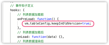
3. 发布视图, 即可生效
恢复所有视图, 步骤如下:
1.找到: /项目目录/modules/@cloudpivot/list/src/components/pc/scripts/application-list.ts
2.找到如图所示代码段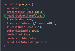
3. 将其中 keepInOldVersion 的值置为 true
4. 保存并重启服务生效
脚本模块
功能:
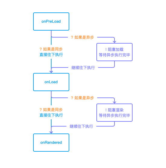
支持视图的三个生命周期:
onPreLoad 视图数据加载前, 仅执行一次
onLoad 视图数据加载后, 翻页或增删视图项会重新触发
onRendered 视图渲染后, 触发规则同 onLoad
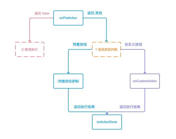
支持按钮操作的三个流程事件:
onPreAction 按钮逻辑执行前, 可通过返回 false 阻拦后续按钮事件流程
onCustomAction 自定义按钮执行逻辑(add、delete等预置按钮配有预置的执行逻辑,不开放直接更改)
onActionDone 按钮逻辑执行完毕
按钮事件是按钮的公共通道, 如果是针对某个按钮的操作, 请对 action.actionCode 进行判断
执行流程控制, 所有关联事件会按照严格的顺序进行触发:
!注: 所有事件节点都可以通过返回 Promise | Promise.all | Promise.race 实现流程的异步串联生命周期执行流程:
按钮事件执行流程:
脚本配置:
options 脚本基本配置
version 脚本支持逻辑的版本, 修改前请查阅相关更新文档, 轻易修改可能会造成脚本运行失效
pageConfig 页面配置 ( version: 1.1 )
apis 替换页面接口
extensions 脚本内部扩展, 可自行添加变量或函数, 以供事件钩子或自定义模板 (customTemplate) 调用
hooks 生命周期和按钮事件的具体实现
事件字段说明:
隐藏字段 vm 可在所有事件钩子和自定接口函数内引用, 指向页面的 Vue 实例
隐藏字段 axios 可在所有事件钩子和自定接口函数内引用, 第三方 ajax 库
隐藏字段 config 可在所有事件钩子和自定接口函数内引用, 项目环境参数配置对象,源自项目 public/config.js
参数字段 data 指向当前视图页数据, onPreAction 事件外所有的钩子都包含
参数字段 action 按钮对象, 按钮数据格式为: { actionCode:'add', name:'新增', ... }, actionCode 作为每个按钮的唯一标识
参数字段 result onActionDone 独有, 指向事件处理的结果, 由按钮执行返回 (预置按钮逻辑 | 自定义按钮逻辑)
示例1: 基本使用
// ...这是一个完整的脚本配置

<script id="customScript">
({
    // 脚本配置: 在对配置修改之前, 请务必认真查阅相关文档
    options: {
        version:'1.0'
    },
    // 脚本扩展, 可自行添加变量或函数, 以供事件钩子或自定义模板(customTemplate)调用
    extensions: {
        greeting:'hey!',
        doSomething() {
            console.log( this.extensions.greeting );
        }
    },
    // 事件钩子定义
    hooks: {
        // 视图数据加载前
        onPreLoad: function() {
        this.extensions.doSomething(vm);
        },
        // 视图数据加载后
        onLoad: function(data) {},
        // 视图数据渲染后
        onRendered: function(data) {},
        // 在所有按钮动作触发前, 可通过返回 false 阻拦后续按钮事件流程, 返回空或其他不阻拦
        onPreAction: function(action,data) {},
        // 自定义按钮执行逻辑
        onCustomAction: function(action,data) {},
        // 按钮事件触发完毕
        onActionDone: function(action,result) {}
    }
})
</script>
得到:
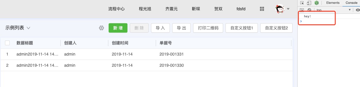
在视图数据加载前, onPreLoad 事件被触发, 调用脚本内部的 extensions.doSomething 函数, 在控制台打印了一句: "hey!"
示例2: 异步流程控制
// ...为了便于演示, 忽略其他内容, 仅展示相关代码段. 真实自定义环境下请保持代码结构完整!

// 视图数据加载前
onPreLoad: function() {
    return new Promise(function (resolve,reject) {
        setTimeout(function() {
            // 这里进行了一些异步操作
            console.log('这里是 onPreLoad 的异步流程');
            resolve();
        }, 1000);
    })
},
// 视图数据加载后
onLoad: function(data) {
    return new Promise(function (resolve,reject) {
        setTimeout(function() {
            // 这里进行了一些异步操作
            console.log('这里是 onLoad 的异步流程');
            resolve();
        }, 1000);
    })
},
// 视图数据渲染后
onRendered: function(data) {
    console.log('视图终于渲染完毕了')
},
得到:
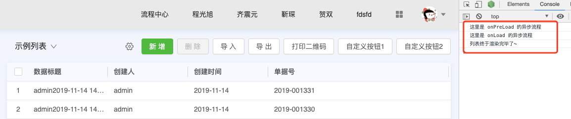
可以看到, 哪怕流程之间插入了某些耗时任务, 仍可以通过返回 Promise 的方式实现严格的流程控制, 保证事件的触发顺序。
示例3: 按钮事件-阻挡预置按钮执行
// ...为了便于演示, 忽略其他内容, 仅展示相关代码段. 真实自定义环境下请保持代码结构完整!

// 编辑 hooks 中的 onPreAction:
onPreAction: function(action,data) {
    if ( action.actionCode==='add' ) {
        // 你可能需要做些判断, 来决定是否可以执行后续流程
        // 假设你已经做好判断, 决定对新增进行阻断, 并做个提示
        alert('新增操作发生了某些异常, 无法顺利执行');
        return false;
    }
},
得到:
onPreAction 针对新增按钮返回了 false, 原本点击会执行的一系列操作都被取消
示例4: 按钮事件的流程控制
// ...为了便于演示, 忽略其他内容, 仅展示相关代码段. 真实自定义环境下请保持代码结构完整!

onPreAction: function(action,data) {
    if ( action.actionCode==='add' ) {
        alert('新增操作发生了某些异常, 无法顺利执行');
        return false;
    }
    // 这是对 自定义按钮1 的控制, 这里使用的 actionCode 是定义按钮时设置的 code 属性
    else if ( action.actionCode==='customActionCode1' ) {
        console.log('customActionCode1 - onPreAction');
    }
},
onCustomAction: function(action, data) {
    // 因为 onCustomAction 是自定义按钮执行的公共通道, 所以在执行任何针对性代码之前都需要进行判断
    // 这里是 自定义按钮1 的执行逻辑
    if ( action.actionCode==='customActionCode1' ) {
        // 获取当前时间的毫秒数
        var nowTimeStamp = Date.now();
        var isEvenNumber = nowTimeStamp%2 === 0

        // 如果毫秒数为偶数, 执行异步流程
        if ( isEvenNumber ) {
            return new Promise(function(resolve,reject) {
                setTimeout(function() {
                    console.warn('customActionCode1 - onCustomAction: 异步流程')
                    resolve({ isEvenNumber, nowTimeStamp });
                },1000);
            });
        }
        else {
            console.log('customActionCode1 - onCustomAction: 同步流程')
            return { isEvenNumber, nowTimeStamp };
        }
    }
},
onActionDone: function(action, result) {
    // 因为 onActionDone 是所有按钮执行完毕的公共通道, 所以在执行任何针对性代码之前都需要进行判断
    if ( action.actionCode==='customActionCode1' ) {
        // 打印 onCustomAction 的返回结果
        console[result.isEvenNumber? 'warn': 'log'](`customActionCode1 - onActionDone: ${result.isEvenNumber?'偶数':'奇数'} - ${ result.nowTimeStamp }`);
    }
}
得到:
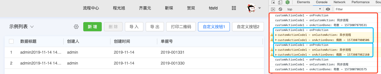
同生命周期事件一样, 按钮事件也依照的严格流程顺序执行.
需要注意的是按钮事件作为公共通道, 执行针对特定按钮的操作时, 需要增加判断. 否则会被当成通用逻辑, 由所有按钮共享
迭代 1.1
替换页面接口
// ...为了便于演示, 忽略其他内容, 仅展示相关代码段. 真实自定义环境下请保持代码结构完整!
<script id="customScript">
    ({
        // 1. 将脚本配置的 version 改为 1.1 或更大(如果可用)
        options: {
            version:'1.1'
        },
        // 2. 进行页面设置: 替换默认 api, 目前仅开放视图接口的替换 ( 即: pageConfig.apis.listData )
        pageConfig: {
            // 所有自定接口的请求里, 可以直接访问到 vm|axios|config 等引用 ( 同事件钩子 ), params 则是视图信息和页码数
            // 当前支持两种自定义模式: combine-合并 | replace-替换
            // 所有自定义接口的返回值不管如何处理 (combine/replace), 最终都会流入事件钩子, 作为 data
            apis: {
                // 2.1 合并模式, 仅替换数据源, 接口数据的校验|健全等仍然走预设逻辑
                listData: function(params) {
                    return axios.post('self.defined/api', params);
                },
                // 2.2 替换模式, 除了替换数据源, 也跳过预设的数据校验和其他相关处理
                listData: {
                    mode:'replace',
                    request: function(params) {
                        return axios.post('self.defined/api', params)
                            .then(function(resp) {
                                // 需要自己对数据进行校验, errcode|errmsg|data 等仅作示范, 具体字段以接口为准
                                if ( resp.errcode!==0 ) throw resp.errmsg;
                                // 也需要自己处理返回值
                                return resp.data
                            })
                            // 一些健全或报错机制
                            .catch(function(err) {
                                vm.$message.error(err.toString());
                            })
                    }
                }
            }
        },
        // 3. 自定义接口的数据会被引入到钩子的 data 中
        hooks: {
            onLoad: function(data) {
                // 如果使用了自定义接口, 这里的 data 由自定义接口返回
            },
        }
        // ...其他内容省略
    })
</script>
Mobile 端自定义
样式模块
同 PC 端
按钮模块
移动端暂不支持按钮自定义功能
模板模块
功能:
支持 Vue 模板的全功能, 相关文档请查阅: https://cn.vuejs.org/v2/guide/syntax.html
模板包含额外的引用:
vm: 视图页面实例; 可通过 vm.foo | vm.bar() | vm.filter 等实现对页面数据|函数的复用;
extensions: 自定义脚本模块处所定义脚本扩展 (如有效); 可用于预设默认值|作基本判断或其他扩展, 需要注意的是扩展内 this 指向它自己, 如不了解不建议使用;
columns: 视图展示项, 由后台配置所得; 某些数据(如创建人/创建时间)是固定存在的, 但是否展示应该以后台配置为准;
listData: 视图数据;
showListItemDetail: 跳转详情页的内部逻辑; 如不了解不建议改动;
getAttachmentUrl: 通过环境变量和附件 id 换取真实附件地址, 不建议改动;
默认模板:
  <template id="customTemplate">
      <!-- 自定义模板容器 -->
      <div id="custom-list-container">
          <ul class="custom-list-wrapper">
              <!-- 视图项 start -->
              <li
                  class="custom-list-item"
                  v-for="(listItem,listItemIndex) in listData"
                  :key='`list-item-${listItemIndex}`'
                  @click="showListItemDetail(listItem)"
              >
                  <!-- 视图项数据 start -->
                  <div class="custom-list-item-content">
                  <div class="custom-list-item-info">
                      <!-- 标题 -->
                      <h3 class="custom-list-item-title">{{listItem.name}}</h3>
                      <!-- 其他字段列表 -->
                      <ul class="fields-list-wrapper">
                          <!-- 展示筛选 -->
                          <template
                              v-if="!!fieldItem.value && ['name','creater','createdTime','sequenceStatus'].indexOf(fieldItem.propertyCode)<0 && columns.some(col=>col.propertyCode===fieldItem.propertyCode)"
                              v-for="(fieldItem,fieldItemIndex) in listItem.fields"
                          >
                              <!-- 字段项 -->
                              <li class="fields-list-item" :key="`field-item-${fieldItemIndex}`">
                                  <label>{{fieldItem.name}}: </label>
                                  <span>{{fieldItem.value}}</span>
                              </li>
                          </template>
                      </ul>
                  </div>
                  <!-- 视图项状态 -->
                  <div class="custom-list-item-status" v-if="columns.some(col=>col.propertyCode==='sequenceStatus')">
                      <img :src="listItem.status.img">
                  </div>
                  </div>
                  <!-- 视图项数据 end -->
                  <!-- 发起人信息 start -->
                  <div class="custom-list-item-creater">
                      <p
                      class="custom-list-item-creater-info"
                      v-if="columns.some(col=>col.propertyCode==='creater')"
                      >
                          <img  class="custom-list-item-creater-info-avatar" :src="listItem.creater.imgUrl">
                          <span class="custom-list-item-creater-info-name" >{{listItem.creater.name}}</span>
                      </p>
                      <p
                      class="custom-list-item-creater-time"
                      v-if="columns.some(col=>col.propertyCode==='createdTime')"
                      >{{listItem.createdTime}}</p>
                  </div>
                  <!-- 发起人信息 end -->
              </li>
              <!-- 视图项 end -->
          </ul>
      </div>
  </template>
得到:
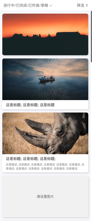
自定义图文模板示例1:
// ...为了便于演示, 忽略其他内容, 仅展示相关代码段. 真实自定义环境下请保持代码结构完整!

<!-- 这是样式设置 -->
<style id="customStyle">
    #custom-list-container .custom-list-item { padding:0; border-radius:.2rem; overflow:hidden; box-shadow:2px 3px 5px #DCDCDC; }
    #custom-list-container .custom-list-item:not(:last-child) { margin-bottom:.35rem; }
    #custom-list-container .custom-list-item .img-wrapper { position:relative; height:4.5rem; background:#F3F3F3 no-repeat center/cover; }
    #custom-list-container .custom-list-item .img-wrapper[style='background-image: url("");']::after {
        position:absolute; top:50%; left:50%;
        transform:translate3d(-50%,-50%,0);
        content:'请设置图片';
    }
    #custom-list-container .custom-list-item .item-info { padding:.2rem .4rem; }
    #custom-list-container .custom-list-item .item-info h3 { font-size:.4rem; font-weight:bold; }
    #custom-list-container .custom-list-item .item-info p { font-size:.3rem; color:#7a7a7a; }
    #custom-list-container .custom-list-item .item-info h3 + p:not(:empty) { margin-top:.1rem; }
</style>

<!-- 这是模板设置 -->
  <template id="customTemplate">
    <!-- 自定义模板容器 -->
    <div id="custom-list-container">
        <ul class="custom-list-wrapper">
            <!-- 视图项 start -->
            <li
                class="custom-list-item"
                v-for="(listItem,listItemIndex) in listData"
                :key='`list-item-${listItemIndex}`'
                @click="showListItemDetail(listItem)"
            >
                <!-- 使用 div-style 而不是 img 标签, 是为了更好地控制图片适配 -->
                <div
                    class="img-wrapper"
                    :style="{backgroundImage:`url(${ getAttachmentUrl((listItem.data.Attachment1573033420152||[''])[0]) })`}"
                >
                </div>
                <div
                    class="item-info"
                    v-if=" listItem.data.ShortText1573033397584 || listItem.data.ShortText1574247766197"
                >
                    <h3>{{ listItem.data.ShortText1573033397584 }}</h3>
                    <p>{{ listItem.data.ShortText1574247766197 }}</p>
                </div>
            </li>
            <!-- 视图项 end -->
        </ul>
    </div>
  </template>
得到:
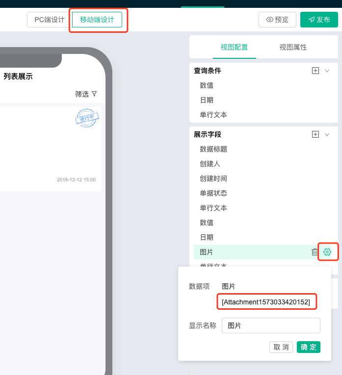
需要注意的是: 每一个视图的每一个数据段, 都有自己独立的 id。示例中的图片附件 Attachment1573033420152、标题文本 ShortText1573033397584, 仅指向该示例视图中的字段, 不代表其他任何视图的任何字段。
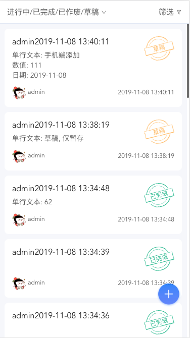
在定制时需要找到并使用自己的字段 id, 可在 管理后台-视图设计 里查看:
自定义图文模板示例2:
```html
// ...为了便于演示, 忽略其他内容, 仅展示相关代码段. 真实自定义环境下请保持代码结构完整!

<!-- 这是样式设置 -->
<style id="customStyle">
    #custom-list-container .custom-list-item {
        position:relative;
        padding:.25rem;
        box-shadow:2px 3px 5px #DCDCDC;
    }
    #custom-list-container .custom-list-item:not(:last-child) {
        margin-bottom:.35rem;
    }
    #custom-list-container .custom-list-item .topic {
        display:flex; flex-direction:row; flex-wrap:wrap;
    }
    #custom-list-container .custom-list-item .img-wrapper {
        position:relative;
        width:2.4rem; height:1.8rem;
        background:#F3F3F3 no-repeat center/cover;
        border-radius:.1rem;
    }
    #custom-list-container .custom-list-item .img-wrapper[style='background-image: url("");']::after {
        position:absolute; top:50%; left:50%;
        transform:translate3d(-50%,-50%,0);
        font-size:.2rem;
        content:'请设置图片';
    }
    #custom-list-container .custom-list-item .item-info {
        margin-left:.25rem;
        width:calc(100% - 2.65rem);
    }
    #custom-list-container .custom-list-item .item-info h3 {
        line-height:1; font-size:.4rem; font-weight:bold;
        /* 单行超出显示省略号 */
        white-space: nowrap;
        overflow: hidden;
        text-overflow: ellipsis;
    }
    #custom-list-container .custom-list-item .item-info p {
        font-size:.3rem; color:#7a7a7a;
        /* 多行超出显示省略号 */
        display: -webkit-box !important;
        overflow: hidden;
        text-overflow: ellipsis;
        word-break: break-all;
        -webkit-box-orient: vertical;
        -webkit-line-clamp: 3;
    }
    #custom-list-container .custom-list-item .item-info h3 + p:not(:empty) {
        margin-top:.12rem;
    }
    #custom-list-container .custom-list-item .author {
        width:100%; height:.3rem; margin-top:.1rem;
        display:flex; flex-direction:row; justify-content:space-between; align-items:center;
        font-size:.26rem; color:#7a7a7a;
    }
    #custom-list-container .custom-list-item .author img {
        height:.26rem; border-radius:50%;
    }
    #custom-list-container .custom-list-item .status {
        position:absolute; right:.2rem; bottom:.56rem;
        width:1.2rem;
    }
</style>

<!-- 这是模板设置 -->
<template id="customTemplate">
    <!-- 自定义模板容器 -->
    <div id="custom-list-container">
        <ul class="custom-list-wrapper">
            <!-- 视图项 start -->
            <li
                class="custom-list-item"
                v-for="(listItem,listItemIndex) in listData"
                :key='`list-item-${listItemIndex}`'
                @click="showListItemDetail(listItem)"
            >
                <div class="topic">
                    <div
                        class="img-wrapper"
                        :style="{backgroundImage:`url(${ getAttachmentUrl((listItem.data.Attachment1573033420152||[''])[0]) })`}"
                    >
                    </div>
                    <div  class="item-info">
                        <h3>{{ listItem.data.ShortText1573033397584 }}</h3>
                        <p>{{ listItem.data.ShortText1574247766197 }}</p>
                    </div>
                </div>
                <div class="author" v-if="columns.some(col=>col.propertyCode==='creater')">
                    <span>
                        <img :src="listItem.creater.imgUrl">
                        {{listItem.creater.name}}
                    </span>
                    <span>{{listItem.data.createdTime}}</span>
                </div>
                <img
                    class="status"
                    :src="listItem.status.img"
                    v-if="columns.some(col=>col.propertyCode==='sequenceStatus')"
                >
            </li>
            <!-- 视图项 end -->
        </ul>
    </div>
</template>
```
得到:
脚本模块
生命周期事件同 PC 端, 暂不支持自定义按钮事件
